
How to Design a SaaS Dashboard People Actually Use
Start with decisions and actions, not decorative metrics. Read a practical framework from CodersDive.
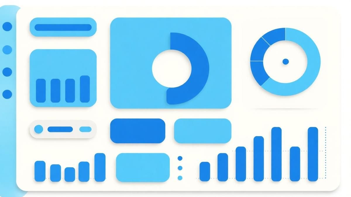
How to Design a SaaS Dashboard People Actually Use is not mainly a technology question. It is a decision about acquisition quality, activation, recurring value, retention, and economics. Teams get into trouble when they select a tool or feature before agreeing on the business behavior that needs to change. Start with decisions and actions, not decorative metrics.
Start with the decision, not the tool
The useful starting point is to describe the current situation in plain language. Who is trying to do what? What slows them down? What information do they need? What happens when the normal path breaks? A good answer exposes the real constraint. It may be missing context, weak trust, unclear ownership, inconsistent data, or an experience that asks too much before delivering value.
Define the outcome in observable terms
Then translate the problem into a measurable product or operational outcome. Avoid goals such as "use AI," "modernize," or "improve the UX." Prefer a statement such as: reduce the time required to complete a task, increase the percentage of users reaching a meaningful milestone, lower preventable errors, or give operators reliable visibility into exceptions. A concrete outcome gives the team a way to compare options and say no to attractive distractions.
A practical framework
A practical framework is:
- 1Choose the behavior that represents value
- 1Segment users by intent and fit
- 1Remove time-to-value friction
- 1Measure cohorts instead of averages
- 1Connect product changes to commercial outcomes
The failure mode to watch
The most common failure is treating the visible interface as the whole solution. In reality, the result depends on the surrounding system: data quality, permissions, integrations, ownership, support, analytics, and the behavior of people who must adopt it. A polished screen cannot compensate for a workflow that remains unclear or a system nobody trusts.
Protect the learning in the first release
For a first release, protect the learning objective. Build only enough to test the central assumption with realistic users and operating conditions. Define what success, failure, and "needs another iteration" look like before launch. That makes the project a controlled decision rather than an expensive act of optimism.
Final thought
The right answer to how to design a saas dashboard people actually use is rarely a universal best practice. It is the approach that fits the product stage, risk, users, operating model, and evidence available now. CodersDive helps teams turn that context into a focused plan, a credible release, and a system they can continue to own.
focused discovery or product engineering engagement.
Most SaaS dashboards end up as "vanity graveyards" because they prioritize data density over executive utility. To build a tool that sticks, you must shift from reporting historical facts to facilitating immediate operational interventions.
The Action-Priority Architecture
A high-utility dashboard follows a top-down hierarchy of urgency. You should organize the interface into three distinct zones: The Status (What is happening now?), The Signal (Why does it matter?), and The Lever (What do I do about it?).
In many dashboards, the "lever"—the action button or link to a sub-page—is hidden two levels deep. In an action-priority architecture, the UI element that solves the problem is embedded directly next to the anomaly. For example, if a churn metric spikes, the dashboard shouldn't just show a red arrow; it should bubble up a list of "High-Risk Accounts for Immediate Outreach" with a direct link to the CRM record.
This reduces the cognitive load on the user. They no longer have to interpret the data, decide on a course of action, and navigate to a separate module. The dashboard becomes a workflow engine rather than a static map.
Engineering for Latency and Contextual Relevance
High-fidelity data is useless if it takes twelve seconds to load. Performance is a core feature of usability. When designing the backend for these dashboards, avoid running complex aggregations on production databases in real-time. Use materialized views or a dedicated analytics warehouse (like Snowflake or BigQuery) to ensure the UI remains snappy.
Furthermore, context is the difference between a metric and an insight. A "7% conversion rate" means nothing without a baseline. Every primary KPI should be accompanied by a secondary comparative metric. Use the following criteria to determine if a visualization is ready for production:
- 1Temporal Context: How does this compare to the same period last week/month?
- 2Segment Context: Is this trend universal, or isolated to a specific cohort?
- 3Threshold Context: Is this number within the pre-defined "Healthy" range?
Mini-scenario: The Infrastructure Manager’s View An AWS cost dashboard shows a 25% spike in spend. A decorative dashboard simply shows a line graph going up. A functional dashboard breaks that spend down by "Unallocated Resources" and "Elastic IP Waste," providing a "Terminate Idle Instances" button right on the main view. This converts a discovery process that usually takes hours into a thirty-second task.
The Operational Health Checklist
Before moving a dashboard widget from Figma to development, audit it against these five technical and functional requirements. If a metric fails more than two, it likely belongs in a deep-dive report, not the main dashboard.
- 1Drill-down Capability: Can the user click this element to see the raw data rows?
- 2Refresh Rate Alignment: Does the data update at the frequency required for the decision? (Real-time for DevOps, daily for Sales, weekly for Finance).
- 3Primary Action Identification: Is there a clear "next step" associated with this metric?
- 4Mobile Responsiveness: Can an executive check this on a phone during a commute and still derive the core "Status"?
- 5Zero-State Design: What does this widget look like if there is no data? (Avoid ugly "404" or empty graph states; use it to prompt a setup action).
Metrics to Watch
Frequently asked questions
Should we allow users to customize their own dashboard layouts? Not initially. Providing a "blank canvas" creates a paradox of choice that leads to low adoption. Instead, provide role-based templates (e.g., The CFO View, The Success Manager View). Only introduce drag-and-drop customization once you have identified power users who have specific, non-standard reporting needs.
How many widgets are too many for a single view? The "Seven, Plus or Minus Two" rule applies here. Human working memory can only process a limited amount of information at once. If your dashboard requires more than nine widgets, it is likely trying to serve too many outcomes. Split the data into focused tabs or separate sub-dashboards based on the specific "job to be done."
Is real-time data always better than batched data? Rarely. For most business-level SaaS dashboards, real-time data is a distraction that creates unnecessary anxiety over minor fluctuations. Hourly or daily refreshes are usually sufficient for strategic decision-making. Reserve real-time pipelines for operational monitoring where an immediate response is required to prevent system failure or revenue loss.
Have a similar decision in front of you? Talk to CodersDive about a focused discovery or product engineering engagement.
Discuss your product SaaS & Growth
Why SaaS Onboarding Fails Before the First Click
Show how positioning, expectations, and handoff shape activation before users enter the product. Read a practical framework from CodersDive.
 SaaS & Growth
Activation Metrics: Find the Moment Users Understand the Value
Define an activation event tied to experienced value rather than account creation. Read a practical framework from CodersDive.
 SaaS & Growth
How to Reduce Churn Without Adding More Features
Focus on expectation fit, onboarding, reliability, support, and recurring outcome delivery. Read a practical framework from CodersDive.