
How to Design Better Empty States
Use empty states to explain value, teach the next action, reduce uncertainty, and establish momentum. Read a practical framework from CodersDive.

How to Design Better Empty States is not mainly a technology question. It is a decision about clarity, hierarchy, feedback, accessibility, and performance. Teams get into trouble when they select a tool or feature before agreeing on the business behavior that needs to change. Use empty states to explain value, teach the next action, reduce uncertainty, and establish momentum.
Start with the decision, not the tool
The useful starting point is to describe the current situation in plain language. Who is trying to do what? What slows them down? What information do they need? What happens when the normal path breaks? A good answer exposes the real constraint. It may be missing context, weak trust, unclear ownership, inconsistent data, or an experience that asks too much before delivering value.
Define the outcome in observable terms
Then translate the problem into a measurable product or operational outcome. Avoid goals such as "use AI," "modernize," or "improve the UX." Prefer a statement such as: reduce the time required to complete a task, increase the percentage of users reaching a meaningful milestone, lower preventable errors, or give operators reliable visibility into exceptions. A concrete outcome gives the team a way to compare options and say no to attractive distractions.
A practical framework
A practical framework is:
- 1Start with the user's task
- 1Make priority visible
- 1Design every state
- 1Reduce interaction cost
- 1Test on real devices and constraints
The failure mode to watch
The most common failure is treating the visible interface as the whole solution. In reality, the result depends on the surrounding system: data quality, permissions, integrations, ownership, support, analytics, and the behavior of people who must adopt it. A polished screen cannot compensate for a workflow that remains unclear or a system nobody trusts.
Protect the learning in the first release
For a first release, protect the learning objective. Build only enough to test the central assumption with realistic users and operating conditions. Define what success, failure, and "needs another iteration" look like before launch. That makes the project a controlled decision rather than an expensive act of optimism.
Final thought
The right answer to how to design better empty states is rarely a universal best practice. It is the approach that fits the product stage, risk, users, operating model, and evidence available now. CodersDive helps teams turn that context into a focused plan, a credible release, and a system they can continue to own.
focused discovery or product engineering engagement.
Moving beyond simple illustrations requires treating empty states as functional conversion points rather than aesthetic placeholders. When designed as technical bridges, these screens resolve architectural friction and guide users through the "cold start" problem.
Architecting for data-dependent states
Modern applications often suffer from a "data lag" that traditional empty states fail to address. This occurs when a user has taken an action—such as connecting a third-party API or initiating a data migration—but the dashboard remains empty because the backend is still processing. A static "No data found" message here is a failure of communication; it creates anxiety that the integration has failed.
Instead, use a "State Persistence" model. If the system is waiting for an external webhook or a batch job, the empty state must reflect the specific stage of the pipeline. For example, if a user connects a CRM to a sales analytics platform, the empty state should display a progress tracker: "Step 1: Authorization successful. Step 2: Fetching 5,000 records (40% complete). Step 3: Indexing for search."
To optimize these transitions, monitor the Time to First Value (TTFV) metric. If the average time from sign-up to the first data-populated screen exceeds 30 seconds, your empty state must move from an "educational" posture to a "status" posture. This reduces support tickets and churn during the critical five-minute window following registration.
Engineering the "Blank Slate" onboarding
For creation-heavy tools—project management, document editors, or IDEs—the empty state is often the most intimidating screen. To lower the cognitive load, move from a blank canvas to a "Scaffolded Start."
Consider a developer platform where the user needs to create their first deployment pipeline. Rather than a solitary "Create Pipeline" button, provide three specific entry points based on common personas:
- 1 The Quick-Start: A "one-click" template for the most common framework (e.g., React on AWS).
- 2 The Importer: A tool to snap in existing configurations from GitHub or Bitbucket.
- 3 The Expert Path: A blank YAML editor for power users who want precision.
Before finalizing your "Blank Slate" strategy, evaluate your current screens against these decision criteria: 1. Cognitive Load: Does the screen offer more than three choices? (If yes, consolidate). 2. Contextual Relevance: Is the "next action" button the primary visual focus? 3. Proximity: Is the call-to-action (CTA) located where the content will eventually appear? 4. Assumed Knowledge: Does the copy explain *why* this screen is empty without using technical jargon? 5. Exit Path: Is there a clear "undo" or "go back" if they arrived at this empty state via a filter or search error?
Measuring empty state efficacy
An empty state is successful only if it is temporary. If your data shows that users remain on an empty state for more than one session, the design has failed to establish momentum. Product leaders should track the Empty State Conversion Rate: the percentage of users who perform the target action (e.g., clicking "Add Task") divided by the number of times the empty state was rendered.
A low conversion rate often signals "Action Paralysis." This typically happens when the empty state is too decorative. If your 404 or "No Results" page features a high-fidelity 3D illustration but has a 0.5% click-through rate to the "Return to Dashboard" button, the design is obstructing the user’s recovery.
Watch for "Repeated Rendering" signals in your telemetry. If a user views the empty search result screen five times in a single session, it indicates a mismatch between your database's indexing and the user's mental model of your search functionality. In this scenario, the empty state should pivot to suggest active search filters or offer a direct link to live chat support.
Frequently asked questions
Should empty states include "Skip" or "Dismiss" options? Only if the empty state is acting as a promotional banner for a feature the user hasn't enabled yet. If the state is a fundamental part of the UI—such as an empty inbox or task list—you should not allow dismissal. Instead, focus on making the CTA as non-intrusive as possible so that the user doesn't feel coerced, while ensuring the path to "filling" that space remains obvious.
How do empty states differ between mobile and web applications? Mobile empty states must account for limited vertical space and the physical "thumb zone." While a web dashboard might include a detailed three-step guide, a mobile empty state should prioritize a single, high-contrast CTA button positioned in the lower third of the screen. Additionally, mobile states should utilize native haptics or subtle animations to confirm when a user has successfully triggered the action that will populate the screen.
Is it better to use "Ghost" loaders or descriptive empty states? A "Ghost" loader (skeleton screen) is appropriate for high-latency data fetching where you expect the results to appear within 1–3 seconds. A descriptive empty state is necessary when no data exists or when the user must perform an explicit action to generate data. Never use a skeleton loader if there is a possibility that no data will return; if the loading ends and the screen remains blank, it creates a jarring visual "pop" that feels like an error.
Have a similar decision in front of you? Talk to CodersDive about a focused discovery or product engineering engagement.
Discuss your product Web, Mobile & UX
What Makes a Website Feel Premium?
Break premium perception into hierarchy, spacing, type, motion, specificity, proof, and restraint. Read a practical framework from CodersDive.
 Web, Mobile & UX
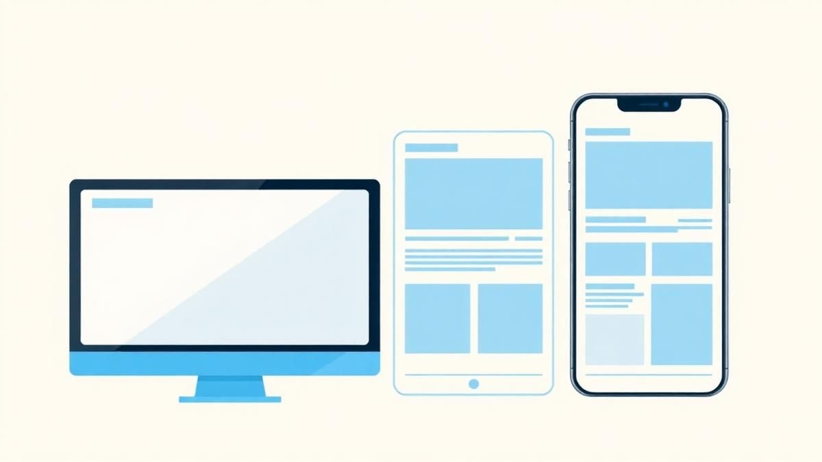
Responsive Design Is More Than Shrinking Desktop
Design task priority, navigation, content order, and interaction specifically for smaller screens. Read a practical framework from CodersDive.
 Web, Mobile & UX
How to Improve a Landing Page Without Redesigning Everything
Use message clarity, proof, CTA hierarchy, friction removal, and performance improvements. Read a practical framework from CodersDive.