
Responsive Design Is More Than Shrinking Desktop
Design task priority, navigation, content order, and interaction specifically for smaller screens. Read a practical framework from CodersDive.
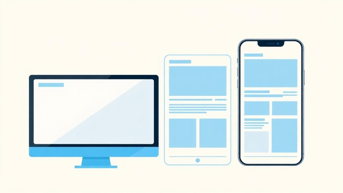
Responsive Design Is More Than Shrinking Desktop is not mainly a technology question. It is a decision about clarity, hierarchy, feedback, accessibility, and performance. Teams get into trouble when they select a tool or feature before agreeing on the business behavior that needs to change. Design task priority, navigation, content order, and interaction specifically for smaller screens.
Start with the decision, not the tool
The useful starting point is to describe the current situation in plain language. Who is trying to do what? What slows them down? What information do they need? What happens when the normal path breaks? A good answer exposes the real constraint. It may be missing context, weak trust, unclear ownership, inconsistent data, or an experience that asks too much before delivering value.
Define the outcome in observable terms
Then translate the problem into a measurable product or operational outcome. Avoid goals such as "use AI," "modernize," or "improve the UX." Prefer a statement such as: reduce the time required to complete a task, increase the percentage of users reaching a meaningful milestone, lower preventable errors, or give operators reliable visibility into exceptions. A concrete outcome gives the team a way to compare options and say no to attractive distractions.
A practical framework
A practical framework is:
- 1Start with the user's task
- 1Make priority visible
- 1Design every state
- 1Reduce interaction cost
- 1Test on real devices and constraints
The failure mode to watch
The most common failure is treating the visible interface as the whole solution. In reality, the result depends on the surrounding system: data quality, permissions, integrations, ownership, support, analytics, and the behavior of people who must adopt it. A polished screen cannot compensate for a workflow that remains unclear or a system nobody trusts.
Protect the learning in the first release
For a first release, protect the learning objective. Build only enough to test the central assumption with realistic users and operating conditions. Define what success, failure, and "needs another iteration" look like before launch. That makes the project a controlled decision rather than an expensive act of optimism.
Final thought
The right answer to responsive design is more than shrinking desktop is rarely a universal best practice. It is the approach that fits the product stage, risk, users, operating model, and evidence available now. CodersDive helps teams turn that context into a focused plan, a credible release, and a system they can continue to own.
focused discovery or product engineering engagement.
Transitioning from desktop to mobile is not an exercise in subtraction, but a re-evaluation of user intent. When screen real estate vanishes, the hierarchy of functions must shift from discovery-led exploration to task-based execution.
The Cognitive Load of Navigation Patterns
Mobile users operate with a "tunnel vision" constraint. On a 27-inch monitor, persistent sidebars and mega-menus provide context and peripheral options. On a 6.1-inch screen, every pixel dedicated to navigation is a pixel stolen from the primary task.
The common mistake is hiding the entire navigation behind a generic "hamburger" icon without considering frequency of use. For B2B platforms or high-utility apps, this adds friction to common tasks. Instead, employ a hybrid model: * Prioritize Top-Tier Actions: Identify the three most clicked actions from your desktop analytics. Place these in a persistent bottom tab bar. * The "Overflow" Strategy: Use the hamburger menu only for secondary settings, legal links, or profile management—never for the core product value. * Progressive Disclosure: Instead of long scrolling lists, use collapsible accordion sections that allow users to scan headings before committing to a deep dive into content.
Trade-off: A bottom tab bar consumes permanent vertical space, but the reduction in "click depth" (the number of taps to reach a target) usually results in a 15–20% increase in session task completion rates.
Interaction Design for the "Thumb Zone"
Touch targets are not just smaller mouse cursors; they are imprecise instruments. Desktop design relies on hover states to reveal information or affordance. Mobile design must be explicit because there is no hover on a touchscreen.
If your responsive design simply shrinks a desktop data table, it becomes unusable. Large tables should be transformed into "cards" or "property lists" where each row becomes a self-contained module.
Decision Criteria for Touch Interactions: 1. Sizing: Ensure all interactive elements are at least 44x44 pixels. This is the anatomical minimum for the average human thumb to interact without "fat-fingering" adjacent links. 2. Gutters and Spacing: Increase the whitespace between call-to-action (CTA) buttons. On desktop, buttons can be side-by-side; on mobile, they should often be stacked vertically to prevent accidental clicks. 3. Input Optimization: Match the keyboard to the data type. If a field requires a ZIP code, the code must trigger a numeric keypad automatically (`input type="number"` or `inputmode="numeric"`). Forcing a user to toggle their keyboard manually is a failure of responsive UX.
Content Reordering and Performance Budgets
Responsive design often hides desktop elements using `display: none` in CSS. While the element is invisible to the user, the browser often still downloads the assets, harming performance markers like Largest Contentful Paint (LCP). True responsive engineering involves conditional loading.
Consider a B2B dashboard. On desktop, a heavy data visualization (like a D3.js chart) might be the centerpiece. On mobile, that chart may be illegible. Instead of just shrinking the chart, replace it with a high-level summary metric and a link to a "Download PDF Report."
Metrics to Monitor: * Input Delay: If your mobile site feels "heavy" or unresponsive to taps, check your JavaScript execution time. Mobile processors are significantly weaker than desktop chips. * Conversion Rate by Device: If mobile conversion is more than 30% lower than desktop, your responsive design is likely failing at the "intent" level—users are finding the friction of the mobile flow too high to complete the transaction. * Content Shift (CLS): Ensure images have defined aspect ratios so the text doesn't jump around as assets load on slower 4G/5G connections.
Frequently asked questions
Should we always use a "Mobile First" design approach? Mobile-first is a useful constraint for clarity, but it is not a dogma. For complex enterprise software where 90% of usage happens on a desktop, you should design for the primary environment first while simultaneously mapping how data modules will stack or transform for the mobile executive who needs an at-a-glance status update.
How do we handle complex data tables on small screens? Avoid horizontal scrolling whenever possible, as it breaks the natural vertical flow. The most effective approach is "Column Persistence," where the primary identifier (e.g., a Client Name) stays fixed while the user swipes other data points, or a total transformation where each table row becomes a standalone card.
Is it better to have a responsive site or a dedicated mobile app? A responsive site is a requirement for accessibility and SEO, whereas a dedicated app is a luxury for user retention. If your product relies on frequent, repetitive tasks or requires native features like background synchronization and push notifications, an app is justified. For discovery and general utility, a high-performance responsive web experience is superior.
Have a similar decision in front of you? Talk to CodersDive about a focused discovery or product engineering engagement.
Discuss your product Web, Mobile & UX
What Makes a Website Feel Premium?
Break premium perception into hierarchy, spacing, type, motion, specificity, proof, and restraint. Read a practical framework from CodersDive.
 Web, Mobile & UX
How to Improve a Landing Page Without Redesigning Everything
Use message clarity, proof, CTA hierarchy, friction removal, and performance improvements. Read a practical framework from CodersDive.
 Web, Mobile & UX
Native App, Cross-Platform App, or Progressive Web App?
Choose based on device capability, distribution, budget, update cadence, and user behavior. Read a practical framework from CodersDive.