
Microinteractions That Help Instead of Distract
Use motion to confirm actions, show status, preserve context, and guide attention without spectacle. Read a practical framework from CodersDive.

Microinteractions That Help Instead of Distract is not mainly a technology question. It is a decision about clarity, hierarchy, feedback, accessibility, and performance. Teams get into trouble when they select a tool or feature before agreeing on the business behavior that needs to change. Use motion to confirm actions, show status, preserve context, and guide attention without spectacle.
Start with the decision, not the tool
The useful starting point is to describe the current situation in plain language. Who is trying to do what? What slows them down? What information do they need? What happens when the normal path breaks? A good answer exposes the real constraint. It may be missing context, weak trust, unclear ownership, inconsistent data, or an experience that asks too much before delivering value.
Define the outcome in observable terms
Then translate the problem into a measurable product or operational outcome. Avoid goals such as "use AI," "modernize," or "improve the UX." Prefer a statement such as: reduce the time required to complete a task, increase the percentage of users reaching a meaningful milestone, lower preventable errors, or give operators reliable visibility into exceptions. A concrete outcome gives the team a way to compare options and say no to attractive distractions.
A practical framework
A practical framework is:
- 1Start with the user's task
- 1Make priority visible
- 1Design every state
- 1Reduce interaction cost
- 1Test on real devices and constraints
The failure mode to watch
The most common failure is treating the visible interface as the whole solution. In reality, the result depends on the surrounding system: data quality, permissions, integrations, ownership, support, analytics, and the behavior of people who must adopt it. A polished screen cannot compensate for a workflow that remains unclear or a system nobody trusts.
Protect the learning in the first release
For a first release, protect the learning objective. Build only enough to test the central assumption with realistic users and operating conditions. Define what success, failure, and "needs another iteration" look like before launch. That makes the project a controlled decision rather than an expensive act of optimism.
Final thought
The right answer to microinteractions that help instead of distract is rarely a universal best practice. It is the approach that fits the product stage, risk, users, operating model, and evidence available now. CodersDive helps teams turn that context into a focused plan, a credible release, and a system they can continue to own.
focused discovery or product engineering engagement.
Moving beyond aesthetic polish requires a shift from viewing microinteractions as "delight" to viewing them as functional feedback loops. To ensure these details serve the user rather than the designer, engineering teams must anchor every transition in spatial logic and performance constraints.
Mapping spatial consistency to reduce cognitive load
The primary cause of distraction in microinteractions is visual non-sequitur—when an element appears or disappears without a logical point of origin. When a user clicks a "Create New" button and a modal suddenly covers the screen, the brain must perform a hard context switch. To preserve context, effective microinteractions use shared-element transitions or "blooming" effects where the new container physically expands from the point of interaction.
Consider a project management dashboard. Instead of a generic loading spinner when opening a task, use a persistent transition where the task card expands to fill the viewport while the internal metadata (assignee, due date) animates into place 100ms later. This creates a mental map: the user knows exactly where they are in the hierarchy because the animation showed them the path.
Trade-offs in Spatial Logic: * Performance vs. Continuity: Complex shared-element transitions can cause frame drops on low-end mobile devices. If the animation jitters, the "mental map" breaks. * Speed vs. Clarity: A 300ms transition is standard for clarity, but power users may find it sluggish over hundreds of repetitions. For high-frequency actions, reduce duration to 150ms or use a non-animated state change for legacy hardware detection.
Engineering the feedback loop for high-latency actions
Microinteractions are most critical during asynchronous operations where the system is waiting on a server response. A common mistake is using a global progress bar that ignores the specific context of the user’s intent. Instead, employ "optimistic UI" coupled with granular micro-feedback to maintain the illusion of speed while managing actual latency.
For example, when a user toggles a priority status on a ticket, the UI should immediately reflect the change (optimistic state) with a subtle "pulsing" border or a tiny syncing icon next to the specific field. Only if the API returns a 400 or 500-level error should the UI revert to the previous state with a haptic shake or a red highlight.
Decision Criteria for Feedback Types: 1. Is the action destructive? Use a two-stage animation (e.g., button shifts to "Sure?" state) rather than a separate confirmation pop-up. 2. Is the latency >200ms? Trigger a skeleton screen or a progress indicator locally within the element, not the whole page. 3. Is the action backgrounded? Use a non-modal notification (like a "toast" that slides in) that allows the user to continue their workflow while the process completes. 4. Is the result binary? Use a simple checkmark or color shift. Don't over-engineer a success state that requires a user to click "OK" to dismiss.
Measuring the impact of micro-animations on conversion
Engineering teams often fail to track whether these interactions actually improve the product. To validate if a microinteraction is "helping" rather than "distracting," you must monitor specific interaction signals via telemetry.
Watch for "rage clicks" or "abort rates" immediately following an animation. If a user tries to click a secondary button while a primary transition is still playing, the animation is too slow and is blocking the user's intent. Conversely, if a user re-opens a menu they just closed, the closing animation likely lacked the visual signpost to show them where the data was saved or moved.
Metrics to monitor: * Time to Task Completion (TTC): Does the addition of a transitional animation decrease the time it takes for a new user to find the next logical step? * Error Rate on Validation: Does an inline, real-time validation shake reduce the submission of invalid forms compared to a static error message at the top? * Animation Jank: Track the `Long Animation Frame` (LoAF) API to identify if microinteractions are causing main-thread contention, which leads to perceived lag.
Frequently asked questions
How do we decide between a skeleton screen and a traditional loading spinner? Skeleton screens are preferable when the layout of the incoming data is predictable, as they reduce perceived wait time by preparing the eye for where information will appear. Use traditional spinners only for unpredictable content or very small, isolated components where a skeleton would look like a flickering glitch.
Should microinteractions be disabled for users who prefer reduced motion? Yes. You should always respect the `prefers-reduced-motion` CSS media query. For these users, replace sliding or scaling animations with instant state changes or simple opacity fades. Functional feedback—like a color change to indicate a success—must remain, but the physical movement should be stripped away to ensure accessibility.
What is the ideal duration for a functional microinteraction? For most interface transitions, research suggests a range of 200ms to 500ms. Interactions shorter than 100ms are often perceived as instantaneous (or a glitch), while those exceeding 500ms feel sluggish. Mobile interactions generally require slightly faster durations (approx. 200-300ms) because the physical screen size is smaller and the eye travels less distance.
Have a similar decision in front of you? Talk to CodersDive about a focused discovery or product engineering engagement.
Discuss your product Web, Mobile & UX
What Makes a Website Feel Premium?
Break premium perception into hierarchy, spacing, type, motion, specificity, proof, and restraint. Read a practical framework from CodersDive.
 Web, Mobile & UX
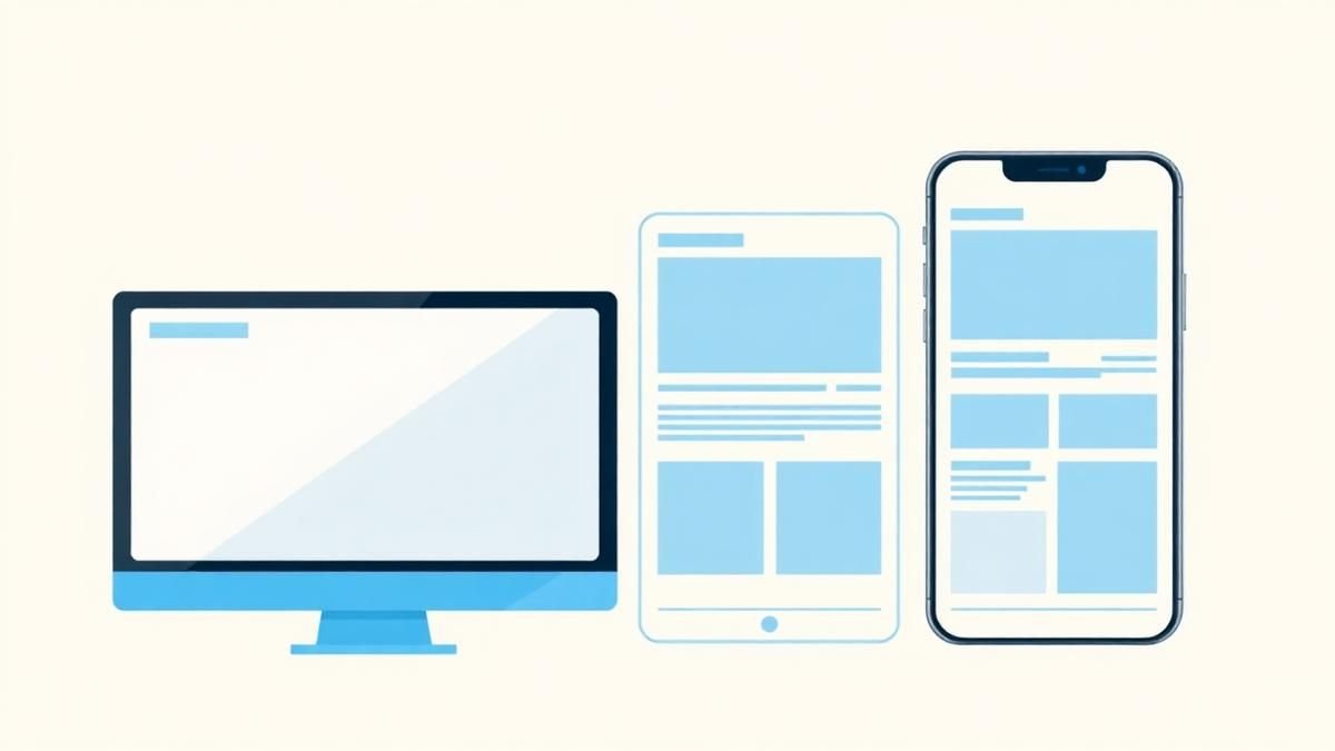
Responsive Design Is More Than Shrinking Desktop
Design task priority, navigation, content order, and interaction specifically for smaller screens. Read a practical framework from CodersDive.
 Web, Mobile & UX
How to Improve a Landing Page Without Redesigning Everything
Use message clarity, proof, CTA hierarchy, friction removal, and performance improvements. Read a practical framework from CodersDive.