
The UX Audit: What to Review and What to Ignore
Focus audits on user goals, friction, comprehension, errors, accessibility, and business impact. Read a practical framework from CodersDive.

The UX Audit: What to Review and What to Ignore is not mainly a technology question. It is a decision about clarity, hierarchy, feedback, accessibility, and performance. Teams get into trouble when they select a tool or feature before agreeing on the business behavior that needs to change. Focus audits on user goals, friction, comprehension, errors, accessibility, and business impact.
Start with the decision, not the tool
The useful starting point is to describe the current situation in plain language. Who is trying to do what? What slows them down? What information do they need? What happens when the normal path breaks? A good answer exposes the real constraint. It may be missing context, weak trust, unclear ownership, inconsistent data, or an experience that asks too much before delivering value.
Define the outcome in observable terms
Then translate the problem into a measurable product or operational outcome. Avoid goals such as "use AI," "modernize," or "improve the UX." Prefer a statement such as: reduce the time required to complete a task, increase the percentage of users reaching a meaningful milestone, lower preventable errors, or give operators reliable visibility into exceptions. A concrete outcome gives the team a way to compare options and say no to attractive distractions.
A practical framework
A practical framework is:
- 1Start with the user's task
- 1Make priority visible
- 1Design every state
- 1Reduce interaction cost
- 1Test on real devices and constraints
The failure mode to watch
The most common failure is treating the visible interface as the whole solution. In reality, the result depends on the surrounding system: data quality, permissions, integrations, ownership, support, analytics, and the behavior of people who must adopt it. A polished screen cannot compensate for a workflow that remains unclear or a system nobody trusts.
Protect the learning in the first release
For a first release, protect the learning objective. Build only enough to test the central assumption with realistic users and operating conditions. Define what success, failure, and "needs another iteration" look like before launch. That makes the project a controlled decision rather than an expensive act of optimism.
Final thought
The right answer to the ux audit: what to review and what to ignore is rarely a universal best practice. It is the approach that fits the product stage, risk, users, operating model, and evidence available now. CodersDive helps teams turn that context into a focused plan, a credible release, and a system they can continue to own.
focused discovery or product engineering engagement.
Effective UX audits fail when they become exhaustive lists of aesthetic grievances rather than prioritized logs of functional friction. To translate an audit into a development roadmap, engineering and product teams must move past surface-level heuristics and evaluate how the interface facilitates or obstructs the underlying data layer.
The High-Value Path: Quantitative Friction and "Dead Ends"
A common mistake in audits is allocating equal weight to the landing page and the deep-funnel configuration settings. For B2B products, the most expensive friction occurs where users interact with complex data inputs. Audit your product by identifying "Dead Ends"—points where a user encounters an error state or a data validation failure that does not provide a clear path to resolution.
For example, consider a SaaS billing dashboard where an "Update Credit Card" action fails due to a backend timeout. A low-value audit notes the lack of a loading spinner. A high-value audit identifies that the system lacks a retry logic or a specific error message telling the user if the failure is on their end (CVV mismatch) or the server's end.
Signals to watch: * Time-to-Task Completion: If a user spends more than 60 seconds on a single-form step, the UX is likely failing at data legibility or input clarity. * Support Ticket Correlation: Map audit findings to common support tags. If "password reset" is a top ticket, audit the email delivery lag and the input constraints, not just the button colour.
The Accessibility Trade-off: Beyond Contrast Ratios
Accessibility is often relegated to a checkbox for contrast ratios and ALT tags. A practical audit evaluates "Keyboard Operability" and "Focus Management," which are critical for power users and those using assistive technology. When auditing a complex web application, you must decide what to ignore—don't waste time auditing the accessibility of decorative background elements when your primary data table isn't navigable via the `Tab` key.
Consider a financial reporting tool. If a user cannot navigate between cells in a generated report using only a keyboard, the audit must flag this as a critical failure. The trade-off is often development velocity; fixing keyboard focus in a custom JS component is harder than changing a hex code, but the business impact on enterprise-level compliance is far higher.
Audit Checklist for Functional Accessibility: 1. Logical Tab Order: Ensure the focus moves in the same order as the visual layout. 2. Visible Focus States: Eliminate `outline: none` in CSS unless a custom, high-contrast focus state is provided. 3. Form Labeling: Every input must have a programmatically linked `<label>` or `aria-label`. 4. Error Identification: Screen readers must announce when an inline validation error appears after a form submission.
Business Impact: Mapping UX to the P&L
An audit should provide the engineering team with a "Reason to Build." This requires categorizing UI issues by their proximity to revenue. Features that sit directly in the path of the "Primary Value Exchange" (e.g., the checkout button, the "Invite Team Member" flow, or the "Export Report" function) should be audited with microscopic detail. Conversely, you can ignore minor alignment issues on the "About Us" page or the footer of a logged-in dashboard.
Identify "Micro-Conversions" within your product. If a user starts a configuration wizard but drops off at step three, the audit should focus on the information density of that specific screen. Is the user being asked for data they don't have yet? Is the "Save for Later" option hidden?
Decision Criteria for Prioritization: * Frequency of Use: How many users interact with this specific component daily? (Priority: High) * Revenue Proximity: Does this component facilitate a transaction or a seat upgrade? (Priority: Critical) * Ease of Fix: Can this be resolved via CSS/HTML, or does it require a change to the API architecture? (Priority: Variable)
Frequently asked questions
How often should a product undergo a comprehensive UX audit? A full-scale audit is typically necessary once a year or before a major platform refactor. However, incremental audits should be triggered by specific telemetry signals, such as a 10% drop in conversion at a specific funnel stage or a spike in churn among users who haven't completed their profile setup. Frequent, smaller reviews of high-impact features are more effective than infrequent, massive documents that are too long for developers to read.
Should we audit the mobile experience at the same time as the desktop application? In B2B contexts, the mobile experience is often a "companion" rather than a primary tool. A practical audit focuses on the specific use cases for each device. On desktop, audit for data density and keyboard efficiency; on mobile, audit for "thumb-friendly" navigation and offline resilience. Do not attempt to make them identical; audit them against the specific goals a user has when switching between devices.
What is the most common distraction during a UX audit? Subjective aesthetics. It is easy to spend hours debating the border-radius of a button or the nuance of your brand's iconography. In a high-level audit, these should be ignored unless they actively impede legibility. The goal is friction reduction, not a style guide update. If an element is functional and brand-aligned, even if it is slightly dated, it should be deprioritized in favour of fixing broken user flows.
Have a similar decision in front of you? Talk to CodersDive about a focused discovery or product engineering engagement.
Discuss your product Web, Mobile & UX
What Makes a Website Feel Premium?
Break premium perception into hierarchy, spacing, type, motion, specificity, proof, and restraint. Read a practical framework from CodersDive.
 Web, Mobile & UX
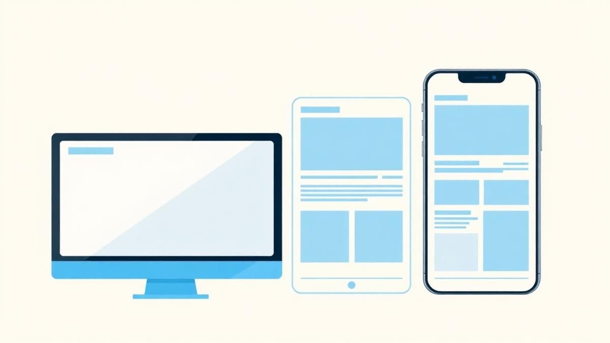
Responsive Design Is More Than Shrinking Desktop
Design task priority, navigation, content order, and interaction specifically for smaller screens. Read a practical framework from CodersDive.
 Web, Mobile & UX
How to Improve a Landing Page Without Redesigning Everything
Use message clarity, proof, CTA hierarchy, friction removal, and performance improvements. Read a practical framework from CodersDive.